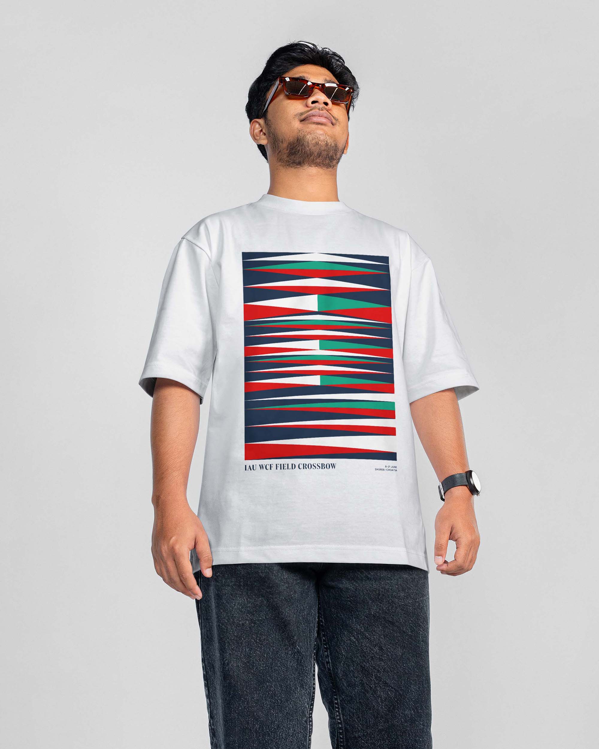
Field Crossbow Championship
Client:
SD Dubrava
Year:
2022
The identity is built to reflect the unique rhythm of the sport — quiet focus followed by explosive action. Visual elements take cues from the mechanics of the crossbow: stretched arrows symbolize tension, momentum, and precision. A classic serif typographic system introduces a sense of tradition and discipline, while dynamic lines and directional shapes evoke motion and control. The color palette is drawn from the bright, high-contrast arrow fletchings typically seen in competition — bold tones of green, blue, and red — bringing energy and visibility to every application. The result is a visual identity that captures the power, structure, and intensity at the core of competitive crossbow shooting.